Natural Purity (aka Raw):
This palette is derived from unfinished wood, cinder blocks and other “make-do” materials and includes shades of white, sand and gray. The raw palette will layer white on white, with textures and shapes to add visual interest. Gray and monotones will be embraced with tonal shifts ranging from beiges to near-black.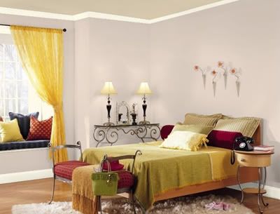 This room features three of the colors in the "Raw" palette: Tucson Winds on the walls, Mascarpone on the trim and Hush on the ceiling.
* Gray 2121-10
* Tucson Winds 1024
* Fossil AF-65
* Steel Wool 2121-20
* Jute AF-80
* Collector’s Item AF-45
* Storm AF-700
* Hush AF-95
* Mascarpone AF-20
* Sterling 1591
* Frappe AF-85
* Chantilly Lace OC-65
Organic Village (aka Urban Silence):
This group of colors reflects the changing delineation between life in the city and life outside the city. As more urban buildings incorporate rooftop gardens and shipping containers are converted into living spaces, the city becomes a softer, more livable place. These changes are reflected in the palette by mixing the gray tones of urban living with vibrant, organic colors like green, rust and terra cotta.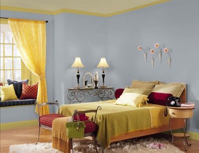 This room features three of the colors in the "Urban Silence" palette: Shadow Gray on the walls, Wasabi as the trim and Lapland on the ceiling.
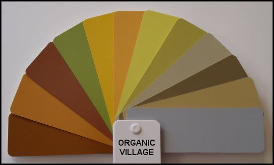 from left to right on fan "Organic Village" also named "Urban Silence":
* Bronze Metallic 30
* Copper Metallic 40
* Abbey Brown 1225
* Winding Vines 532
* Glen Ridge Gold 301
* Old Gold 167
* Yellow Tone 370
* Wasabi AF-430
* Lapland AF-410
* Rustic Taupe 999
* Rattan AF-375
* Shadow Gray 2125-40
Simplexity (aka Nocturnal Habit):
The best way to think of “simplexity” design is repetitive patterns clustered into simple formats. The repetitive pattern brings order to chaos. Simplexity colors are very complex, they have a lot of depth to them, but they’re easy to use.An example is a color that looks black, but it’s really purple. It’s almost black but it has an undercurrent of blue and red running underneath it and the way that the light hits it, you start seeing the nuances of how those colors flip underneath it.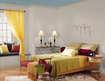 This room features three of the colors in the "Simplexity" palette: Thunder on the walls, Meditation on the trim and Amsterdam on the ceiling.
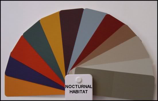
from left to right on fan "Nocturnal Habitat":
* Buttered Yam AF-230
* Majestic Violet 2068-10
* Merlot Red 2006-10
* Hidden Falls 714
* Dried Mustard 2158-10
* Caponata AF-650
* Amsterdam AF-550
* Arroyo Red 2085-10
* Carob AF-160
* Meditation AF-395
* Thunder AF-685
* Gargoyle 1546
Global Oneness (aka Private Identity):
This palette deals with how we express our individuality and differentiates between the individual and the world. Colors will include organic brights teamed with pales to create unusual pairings. Metallics will be warm and cool, while surfaces, especially blacks and vinyl, will have slick, wet looks. Denim and brass will be key features in this forward-thinking trend.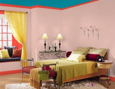 This room features three of the colors in the "Private Identity" palette: Desert Rose on the walls, Tricycle Red on the trim and Lucerne on the ceiling.
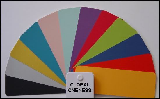
* Black Satin 2131-10
* Silver Metallic 20
* Gold Metallic 10
* Pacific Palisades 762
* Desert Rose 2094-50
* Thunderbird 675
* Fire and Ice 1392
* Blushing Red 2079-20
* Perennial 405
* Lucerne AF-530
* Tricycle Red 2000-20
* Mango Punch 154
Color trends for Fall and Winter are in one word: BOLD!
The color palettes for paint companies will continue to be in the bold family lines of warm tones, with hints of homage to the past for those young enough to recall the pea-greens and mustard golds of the 50's and 60's. With colors like periwinkle, navy, and chartreuse back on the color spectrum of acceptability, we should see some interesting combinations in homes. Throw in some rusty reds, fuchsia, lime green, plum and navy, and you have the "new" color palette being touted by groups such as ColorMix 08 found at Sherwin Williams. Not all palettes are bold, you can also enjoy a wonderful soothing palette of colors that have a peachy hint of a base color to warm them up.
The difference with houses today with painted walls are the furniture pieces that sit in the rooms that we find are mostly in the dark tones with classic clean lines. Framed art is also a way to create a new look and the wood frames have replaced the faux gilded frames from the past with a fresh and clean look that sits well on any wall color.
For guidance on what color to paint walls, take inspiration from your art. If you have a fabulous key piece that you really like, select a color from the piece of art, and use that as the background color or inspiration accent color for your room. If you are not confident putting bold colors on walls, you don't have to paint the wall that color, but how about placing some lovely accent pillows in the accent tone on your sofa or chair? Or add an urn or other decorative object in that color. Add a thick faux mink throw draped over the arm of a sofa or chair, and your look says, "Come and sit - enjoy!"
You can also take inspiration from nature or a journey you have taken to another country where the culture of color inspires you! Get inspired by the costumes, the food palette, and buildings.
When looking at nature, notice how blues and greens blend together, and a pop of color such as yellow, red, purple, or pink give a special touch and draw the eye, much like a blossom of a flowering shrub captures your attention.
If you are looking to achieve a fresh look for your "tired" interior, consider the services of a Home Staging professional that can apply their "Staging to Live" techniques in your home. Unlike designers or decorators that will try to sell you on expensive new furnishings (as they typically make their profit on the margin of wholesale to retail cost), an ASP Stager will use what you have, apply a fresh set of skilled eyes to your room, and refresh your interior with their creativity.
Here are some tips from pros on the Color Trends for 2008-2009:
• Purple - in fashion and home, purple is the front runner of color. It has come back to the forefront as the color du jour - and we will see it in both homes and in fashion.
• Yellow - Yellow is the new orange! Orange will still remain with a presence, but not quite as hot as yellow. This is good news for both homes and fashion where not everyone was a fan or orange. Yellow can be bright or soft - and used as an accent for a pop of color in a room - and it really adds pizzazz. Of course, yellow is on the opposite side of the color spectrum of purple - so combine these two colors for some really great results.
• Blues - varying shades from soft spa blues to robin's egg blues to deep sea blues. Many nature inspired blues. Blue is soothing and relaxing - so use this in rooms where you want to linger or rest. Again, used as a key accent color blue is a very effective balance color.
• Greens - with all of the buzz about the environment, natural greens are making their way into the home, and green also has many hues from forest green with a black undertone to a lime green with a yellow undertone. Green is soothing and works great with blue and even purple as a complementary color.
• Browns -look great with other hot colors, especially the softer colors where black would be too harsh. Brown can be used with furniture - with warm woods, darker brown woods helping anchor a space, or even with accent items like pillows, faux mink throws, and surface decor.
TIP: Don't get carried away and use all these colors on your walls - it would be too much for most homeowners. One pop color on a wall works, but having a Disneyland look in a house chops up the flow and makes each room feel smaller. Putting very dark colors on walls absorbs the light, and brings the walls together, reducing the feel of space in the room.
Instead, take inspiration from some of the darker or bolder colors and bring in decor and accent pieces that can highlight a room. Perhaps it's a piece of art you find that has some of these colors, and then add some new accent pillows or an area rug that has the same tones, and your room will look renewed!
We are also seeing the return of patterns in fabrics - stripes, floral and metallics are back in style. Again, instead of making a full commitment to a fabric with a large sofa upholstered in one of these new trends, simply pick up some accent pillows or throw with some fun patterns or colors, and you will be right up with the trends. Look for metals that are not shiny as that look is out - no brass - but you can incorporate brushed nickel finishes and an aged look with some metels with a natural or faux patina.
Kitchen and Flooring trends remain fairly neutral with some great new materials on the market that look like more expensive counterparts, but are much more cost effective. Have fun with kitchens - adding decor for color works. Be careful not to overdo paint in the kitchen - again less is more even for living - and adding an accent wall or painting your backsplash for a dose of color works. Painting the whole kitchen red, is too much.
Fall and Winter are great times to decorate or re-decorate our homes with new furniture or fixtures, but when the budget does not allow for that, you can also just transition for the seasons, bringing in decor and items in tune with the season - with the idea that we will transition to spring next year. This works because as the weather turns colder outside, we seek warmth as we layer our clothing. We can also layer our furnishings inside and layer our decor. Warm up our interiors with color and fabric layers. Bring in the warm tones with accent decor, get out your candles and add ambient light in rooms that help warm up the space. Enjoy snuggling with a new, soft throw and smell the crisp air outside.
Embrace Fall and Winter with the colors found in nature - and have fun in moderation with the bolder looks we see continuing in to 2009.
INSPIRATION #493
9 years ago
1 comment:
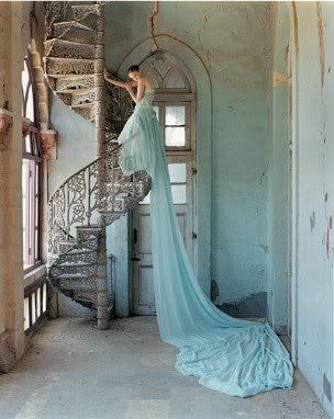
I like very much the Simplexity palette, but from all photos the best looking is the one at the top of the page:)
Post a Comment